Consumerization: What B2B can learn from B2C
Consumerization of IT refers to how consumer-oriented tech impacts B2B and enterprises. It becomes obvious in the “usability gap” between consumer apps and enterprise software.
Here’s is how the user centricity differs between B2B and B2C, and what B2B can learn from B2C to improve their efficiency.
User Centricity
One of the most striking differences is how B2C platforms prioritize an intuitive, engaging user experience (UX) to increase retention. In contrast, B2B systems prioritize functionality for complex transactions, often at the expense of user-friendliness.
Just compare a list – B2C lists are usually clean and neat, while B2B lists might be long with tiny text, designed to display as many records, like invoices, as possible.
With that said, the challenge for B2B is that users often need to see more on their screen as they need more information for their complex tasks than simple navigation.
Many B2B apps are internal, and we previously had a society where employees stayed with the same employer for over 20 years. People had time to learn complex systems, believing their ERPs worked well because they had spent a decade finally mastering them. Today, with employees switching jobs every 1-2 years, it is crucial for B2B applications to be easy to learn quickly. Systems need to be intuitive, preferably with as little education as possible, to enable rapid onboarding.
How can B2B learn from B2C?
Companies like Uber, Airbnb, Apple, and Google are often referred to as best-in-class. While it might be challenging to replicate B2C applications due to the higher complexity of B2B systems, we can certainly draw inspiration from B2C.
In B2C, there are often clear templates and best practices, such as those used in online retail and food delivery. Users are familiar with these templates and know intuitively how to navigate. While the “correct” process might not be as clearly globally defined for B2B, we can still draw valuable lessons from B2C such as:
Clear CTAs: Use clear Call to Actions to help users understand where to click
Familiar icons: Adopt icons from B2C (e.g., “save”, “favorite,” “add to cart”) to make interfaces more intuitive
Notifications: Utilize notifications to clarify workflows and highlight deviations
Location features: Utilize "Use my location" features for convenience where distance is relevant
Process guidance: Guide users through their processes in an intuitive manner
Example – Authentication simplification
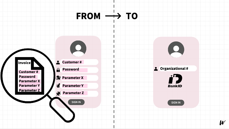
B2B can improve user experience by adopting modern authentication methods, similar to B2C. One client had a login process to their portal requiring their customers to enter their customer number, password and a few other parameters to sign in. This information was only available at invoices, additionally requiring them to locate an invoice each time. This process was simplified by switching to BankID, a digital ID method used in Sweden, combined with the company’s organizational number.
BankID is a secure digital ID used in Sweden for identity verification and online transactions. Trusted by banks and public authorities (among others), it eliminates the need for separate passwords and reduces the risk of using someone else’s account. BankID connects with the company register and the Swedish population register (folkbokföringen), making authentication seamless, reducing manual effort, and improving the overall login experience.
Example – Device usage and notifications
B2B can also be inspired by the usage of modern devices like the Apple Watch, the effective use of notifications and in-app microlearning. Take the Apple Watch app Volvo Cars developed for their service technicians as an example (link). By having their workflow on their mobile device utilizing B2C inspired calendar views and notifications, the workshop efficiency and thereby customer satisfaction increased. The need for process training where a trainer would travel around with a PowerPoint deck could be replaced by instructions and haptic notifications in the Apple Watch, informing the users of new processes, customer arrivals and what to do.
It all boils down to relevance
In B2B, relevance is key. Users typically come to the application with a specific task in mind and do not have the time or interest to explore every corner of it. For example, in B2B aftermarket e-com, users are not interested in all spare parts on the site, only those that fit their specific machine.
Not everyone needs to see everything at the same time. Assume no one reads anything. Allow users to choose to view more information instead of overwhelming them with details by default. Work with relevance and display only the information relevant to the user’s immediate needs and consider using e.g. overlays or nudges to point out unused features when necessary.
Conclusion
Consumerization in practice is not about copying B2C directly but drawing inspiration to challenge, simplify, and make B2B interfaces, processes, and experiences more intuitive. By adopting user-friendly design principles from B2C, organizations can improve efficiency, reduce system training and onboarding, as well as enhancing the end-customer experience.
Author: Emelie Gertmo, Consultant at Waye. Emelie has a long experience in automotive and aftermarket, making complex processes and technology intuitive and easy to work with.


